Background
While attending rstudio::conf 2018, I heard about the tibbletime package developed by Davis Vaughan and Matt Dancho for analysis of time series data. In his conference talk, Davis Vaughan presented several business/finance examples to showcase tibbletime’s functionality and mentioned a few, general non-business applications at the end of his talk. I couldn’t help but think about how this package might be especially helpful for environmental scientists working with time series data. I really liked rollify(), which could be used to create and apply custom moving-window functions (e.g., mean()) to time series data; where the size of the window (e.g., 3 days) could also be specified. I was aware of the movingAve() and movingDiff() functions in the smwrBase package developed by the U.S. Geological Survey (USGS), which calculate moving average and difference, respectively. However, rollify() has more flexibility; it can be used to take a rolling standard deviation, a rolling ratio of two build in R functions, or a rolling custom function. The possibilities are endless.
Shortly after the conference, I also heard about the dataRetrieval package developed by the USGS from my friend, Dr. Kristina Hopkins. This package allows users to import USGS streamflow data (and any other data associated with USGS streamgages) directly into R. Very exciting!
Goals of this Post
This all sounded so amazing and I had to try it out, which brings me to the goals of this blog post:
- Use the
dataRetrievalpackage to download streamflow data into R for two USGS streamgages - Use the
tibbletimepackage (along with othertidyversepackages) to aggregate and plot these data for different time periods
Special thanks to Dr. Kristina Hopkins at the USGS in Raleigh, NC for sharing her dataRetrieval code and to Dr. Laura DeCicco at the USGS in Middleton, WI for pointing out key features of the dataRetrieval package!
First let’s load the R libraries that we’ll need to run the code in this post.
library(tidyverse)
library(lubridate)
library(tibbletime)
library(dataRetrieval)
Before downloading data, you’ll have to specify a desired date range and look up the USGS streamgage identification number(s) for streamgage(s) of interest.
# define start and end dates
start_date <- "2017-01-01"
end_date <- "2018-01-01"
You’ll also need to specify the parameter code for the data you want to download (e.g., discharge, stage height, etc.). But how do we know what the parameter code is for our favorite data? The USFS have included a look-up table for that! To figure this out, we can save parameterCdFile to a variable named parameter_code_metadata and View(parameter_code_metadata) it to see the parameter code look-up table in RStudio. We can even search through different columns of these data by clicking on the ‘Filter’ funnel icon in the RStudio View() window.
# look for parameters you want
parameter_code_metadata <- parameterCdFile

# after some looking around, we see that we want code "00060" for discharge in cubic feet per second (cfs)
my_parameter_code <- "00060"
After looking through the table, I figured out that 00060 is the code for discharge in cubic feet per second (cfs). We can save this to the variable my_parameter_code, which leaves one last step…
We have to decide which streamgage to choose! If you’d rather do this manually/look at a map, you can you can go to the USGS Water of the Nation website and use their mapping tool to look up sites visually. Alternatively, you can use the look-up tables in the dataRetrieval package to do this in R.
Let’s say we want to see all the sites in North Carolina. We can save the output from the whatNWISsites() function to the variable nc_sites.
nc_sites <- whatNWISsites(stateCd = "NC", parameterCD = "00060")Just like we did for the parameter code, we can use ‘Filter’ funnel icon in the RStudio View() window to look for sites that might be interesting to us. I looked for ‘Eno River’ sites and discovered two that I’ll use here: Eno River at Hillsborough, NC (#02085000) and Eno River at Durham, NC (#02085070). The Hillsborough site is upstream of Durham and is surrounded by less urban development.
Note: If you want to search what data is available (e.g., period of record, available parameters, etc.) you can use whatNWISdata(). See ?whatNWISdata for help on how to use this. For ease of use (and because Dr. Kristina Hopkins shared them with me! Thank you!), the service codes include: “dv” for daily data, “iv” for instantaneuos data, “qw” for water quality data, “sv” for site visit data, “pk” for peak measurement data, and “gw” for groundwater data.
# define sites (you can also just use one site here)
site_numbers <- c("02085070", "02085000")

# save site info to a variable so we can look at it later
site_info <- readNWISsite(site_numbers)
Now we’re ready to download discharge data for these two sites!
discharge_raw <- readNWISuv(site_numbers,
                            my_parameter_code,
                            tz='America/Jamaica',
                            start_date, end_date)
Let’s tidy thse data up a bit. We’ll change some of the column names so they make more sense later to us, add a column with the site name, and select only the most important columns. If you are using this for something more formal, you will want to do some QA/QC by checking out the discharge_code column. You can read more about what these codes mean here.
discharge = discharge_raw %>%
  select(site_number = site_no,
         date_time = dateTime,
         discharge_cfs = X_00060_00000,
         discharge_code = X_00060_00000_cd,
         time_zone = tz_cd) %>%
  mutate(site_name = case_when(
    site_number == "02085000" ~ "eno_rv_hillsb",
    site_number == "02085070" ~ "eno_rv_durham")) %>%
  select(site_name, date_time, discharge_cfs)
Using head(), we see that we’ve downloaded 15-min intervals of streamflow data for both sites.
head(discharge, n = 10)
##        site_name           date_time discharge_cfs
## 1  eno_rv_hillsb 2017-01-01 00:00:00          9.68
## 2  eno_rv_hillsb 2017-01-01 00:15:00          9.68
## 3  eno_rv_hillsb 2017-01-01 00:30:00          9.68
## 4  eno_rv_hillsb 2017-01-01 00:45:00          9.68
## 5  eno_rv_hillsb 2017-01-01 01:00:00          9.68
## 6  eno_rv_hillsb 2017-01-01 01:15:00          9.68
## 7  eno_rv_hillsb 2017-01-01 01:30:00          9.32
## 8  eno_rv_hillsb 2017-01-01 01:45:00          9.32
## 9  eno_rv_hillsb 2017-01-01 02:00:00          9.32
## 10 eno_rv_hillsb 2017-01-01 02:15:00          9.32
Let’s say we need daily discharge data to calibrate a hydrology model. We can aggregate the 15-min data to daily data pretty easily using tidyverse functions.
discharge_daily <- discharge %>%
  mutate(year = year(date_time),
         month = month(date_time),
         day = day(date_time)) %>%
  mutate(date = ymd(paste0(year, "-", month, "-", day))) %>%
  select(site_name, date, discharge_cfs) %>%
  group_by(site_name, date) %>%
  summarize(avg_daily_discharge_cfs = mean(discharge_cfs))
## `summarise()` regrouping output by 'site_name' (override with `.groups` argument)
Now let’s try plotting the daily hydrograph (i.e., average daily discharge vs time) for both sites.
ggplot(data = discharge_daily) +
  geom_line(aes(x = date, y = avg_daily_discharge_cfs, color = site_name)) +
  facet_wrap(~site_name, nrow = 2, ncol = 1) +
  ylab("Average Daily Discharge (cfs)") +
  theme(panel.grid.major = element_blank(),
        panel.grid.minor = element_blank(),
        panel.background = element_blank(),
        axis.line = element_line(colour = "black"),
        axis.text.x = element_text(angle = 90, vjust = 0.5, hjust = 1))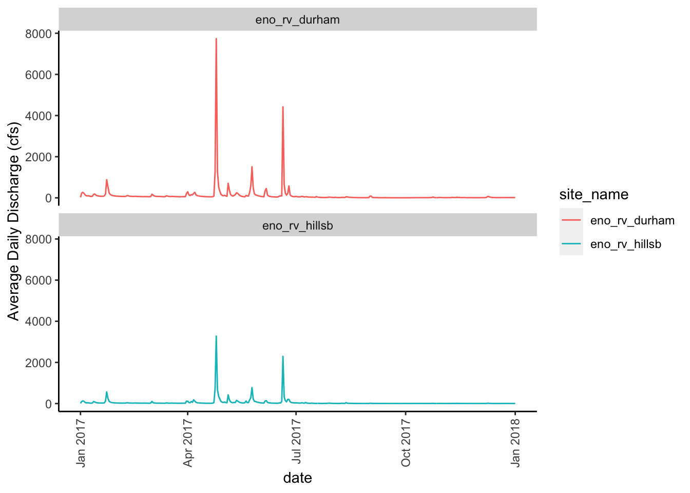
As expected, we see that the two sites mimic one another over this one year time period. Remember, the Eno River at Hillsborough site is upstream of the Eno River at Durham site. We also see that the Eno River at Durham site (top, red line) has some higher peaks than the Eno River at Hillborough site (bottom, teal line). This also makes sense since the Durham site is surrounded by more urbanized land than the Hillsborough site.
Ok, so let’s get back to the tibbletime package. What if we want to compare different time spans? That is, not just daily, but maybe hourly or half day. First we have to define our rolling functions and their associated time spans.
For this post, let’s create half hour, hourly, half day, and day rolls.
mean_roll_30min <- rollify(mean, window = 2)
mean_roll_1hr <- rollify(mean, window = 4)
mean_roll_12hr <- rollify(mean, window = 48)
mean_roll_1d <- rollify(mean, window = 96)
In this post we’ll focus on using the mean in our rolling functions but I can think of several other functions that might be useful for streamgage data lovers: difference, standard deviation, or maybe even the ratio between two calculations. You could even write your own function and roll that. Pretty flexible, right?
After you you write the function my_roll_function <- rollify(<function>, window = <row span>) then you can call my_roll_function(<original data column>) in mutate() to create a new column. Depending on the function you’re using, you could maybe even do a nested roll based on a previous column you created. This seems helpful if you’re taking differences or summations across different time scales.
Let’s roll (our data)! :D
discharge_roll <- discharge %>%
  group_by(site_name) %>%
  mutate(
    halfhr_avg_discharge_cfs = mean_roll_30min(discharge_cfs),
    hourly_avg_discharge_cfs = mean_roll_1hr(discharge_cfs),
    twelvehr_avg_discharge_cfs = mean_roll_12hr(discharge_cfs),
    daily_avg_discharge_cfs = mean_roll_1d(discharge_cfs)) %>%
  na.omit()

# use na.omit() to delete some of the first cells in the dataframe that are NA's due to rolling
Let’s look at these data.
head(discharge_roll, n = 10)
## # A tibble: 10 x 7
## # Groups:   site_name [1]
##    site_name date_time           discharge_cfs halfhr_avg_disc… hourly_avg_disc…
##    <chr>     <dttm>                      <dbl>            <dbl>            <dbl>
##  1 eno_rv_h… 2017-01-01 23:45:00          12.1             12.1             12.1
##  2 eno_rv_h… 2017-01-02 00:00:00          12.1             12.1             12.1
##  3 eno_rv_h… 2017-01-02 00:15:00          11.6             11.8             12.0
##  4 eno_rv_h… 2017-01-02 00:30:00          11.6             11.6             11.8
##  5 eno_rv_h… 2017-01-02 00:45:00          11.6             11.6             11.7
##  6 eno_rv_h… 2017-01-02 01:00:00          12.1             11.8             11.7
##  7 eno_rv_h… 2017-01-02 01:15:00          12.1             12.1             11.8
##  8 eno_rv_h… 2017-01-02 01:30:00          12.1             12.1             12.0
##  9 eno_rv_h… 2017-01-02 01:45:00          12.1             12.1             12.1
## 10 eno_rv_h… 2017-01-02 02:00:00          12.5             12.3             12.2
## # … with 2 more variables: twelvehr_avg_discharge_cfs <dbl>,
## #   daily_avg_discharge_cfs <dbl>
The dataframe has maintained it’s length (except for the NA columns at the top we deleted using na.omit()) and there are four new columns with aggregations of discharge at the time scales we specified in our rolling functions.
We can plot this as a hydrograph as we did above or we can also plot each aggregation period against the original 15-min data to see how they compare. Let’s show the latter.
my_colors <- c("a_half_hour" = "grey20", "b_hour" = "grey40", "c_half_day" = "grey60", "d_day" = "grey80")

ggplot(data = discharge_roll) +
  geom_point(aes(x = discharge_cfs,y = halfhr_avg_discharge_cfs, color = "a_half_hour"), size = 1) +
  geom_point(aes(x = discharge_cfs, y = hourly_avg_discharge_cfs, color = "b_hour"), size = 1) +
  geom_point(aes(x = discharge_cfs, y = twelvehr_avg_discharge_cfs, color = "c_half_day"), size = 1) +
  geom_point(aes(x = discharge_cfs, y = daily_avg_discharge_cfs, color = "d_day"), size = 1) +
  facet_wrap(~ site_name, ncol = 1, nrow = 2) +
  scale_color_manual(name = "Time Scale", values = my_colors) +
  xlab("15-min Dicharge (cfs)") +
  ylab("Aggregated Discharge (cfs)") +
  theme(panel.grid.major = element_blank(), panel.grid.minor = element_blank(),
        panel.background = element_blank(), axis.line = element_line(colour = "black"))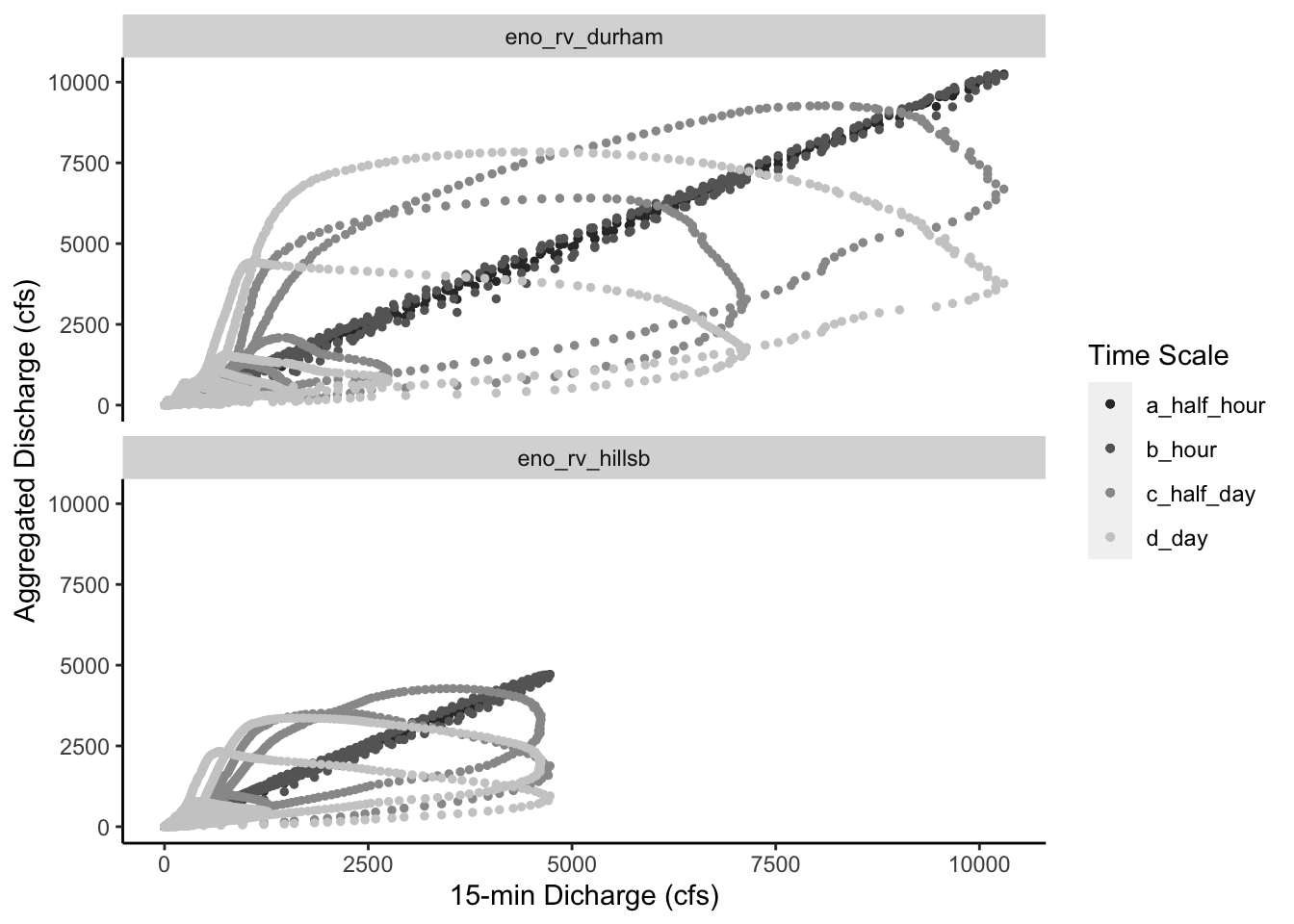
There are some interesting patterns that (I think) are worth pointing out:
Based on the daily hydrograph we plotted above, the Eno River at Durham (top) data set has higher peak events. This was expected given the daily hydrograph we plotted above. We see that discharge values go up to over 10,000 cfs at the Eno River at Durham site whereas for the Eno River at Hillsborough they only go up to about 5,000 cfs.
I thought it was interesting that the half hour and hourly data sets match the 15-min time scale closely; we see the points follow the 1:1 line for both. However, the half day and daily data show dampened responses with lower peaks and skew away from the 1:1 line. This dampening wasn’t completely surprising to me but it made me wonder how this would impact downstream applications of daily streamflow data. Is this dampening represented by a linear or non-linear relationship? Is this relationship a function of watershed properties or near gage properties. Lot’s of questions like this come to mind. Most of which deal with being able to account for and maybe even predict this dampening.
The last thing that I wanted to point out was the spiraling nature of these figures. The more we aggregate these data, the more it seems to spiral into the origin at zero. Also, it’s interesting to compare the overlap of time scale spirals (i.e., half day and daily) between the two gages. More specifically, we see that one ring of the half day and daily spirals overlap for the Eno River at Hillsborough site but we don’t see this overlap at the Eno River at Durham site. I wonder why? Is it because urban development has caused a little more disconnection between water stored in the landscape for the Eno River at Durham site? Do antecedent moisture conditions play a larger role in future stream response in the less developed Eno River at Hillsborough site?
There are still so many questions floating around in my head but figuring out how to integrate the tibbletime and dataRetrieval packages has been fun! If you know of any publications that address these questions or just want to say Hi!, please let me know via Twitter.